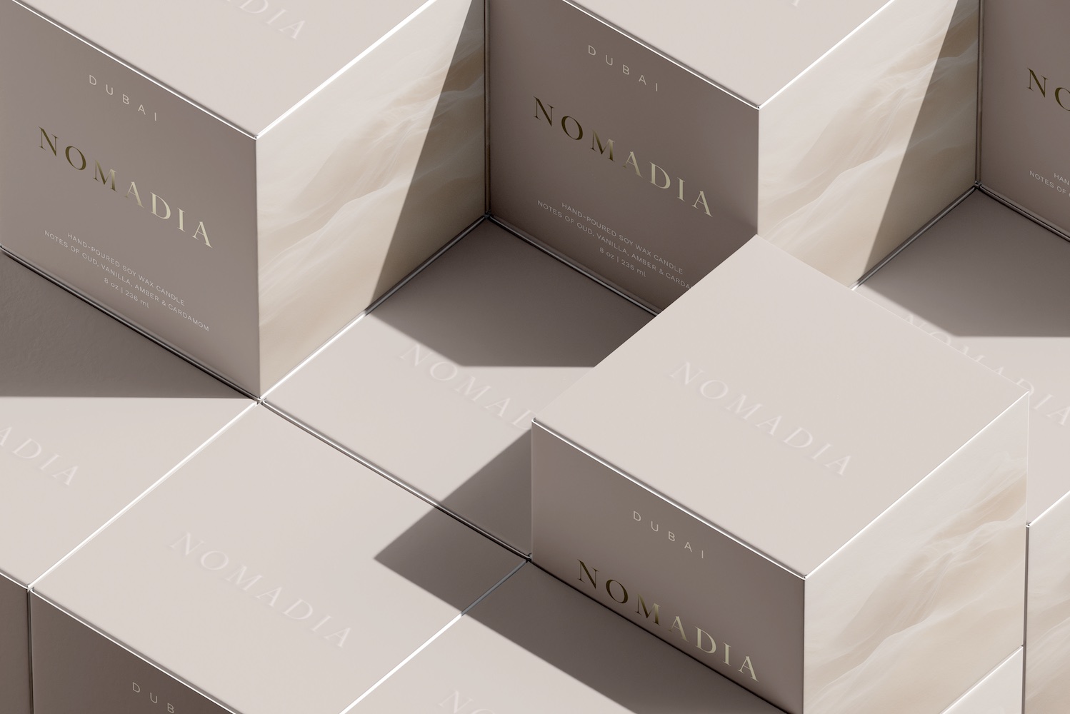
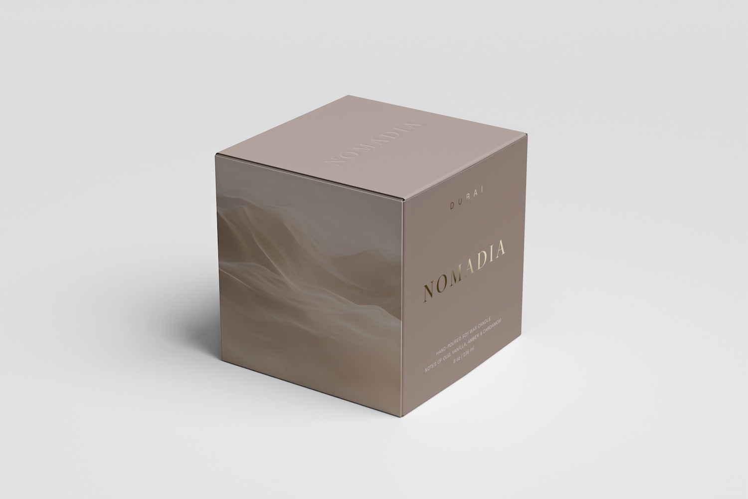
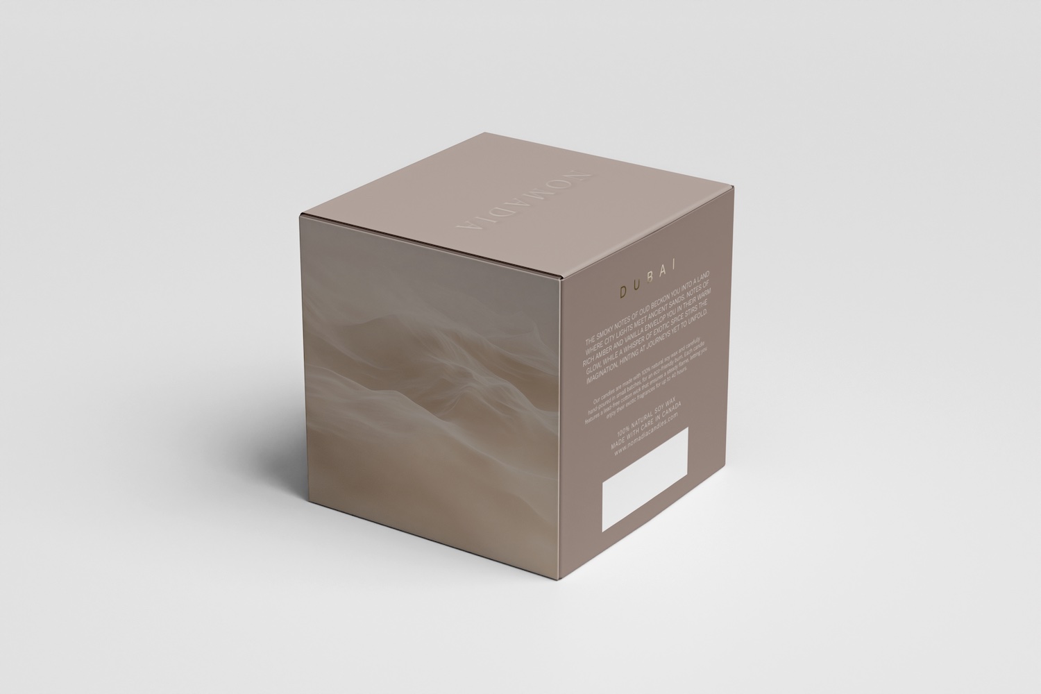
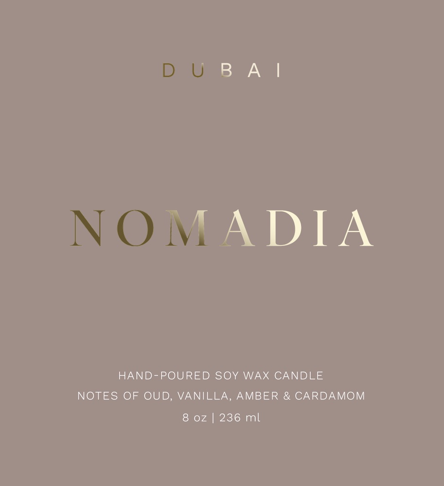
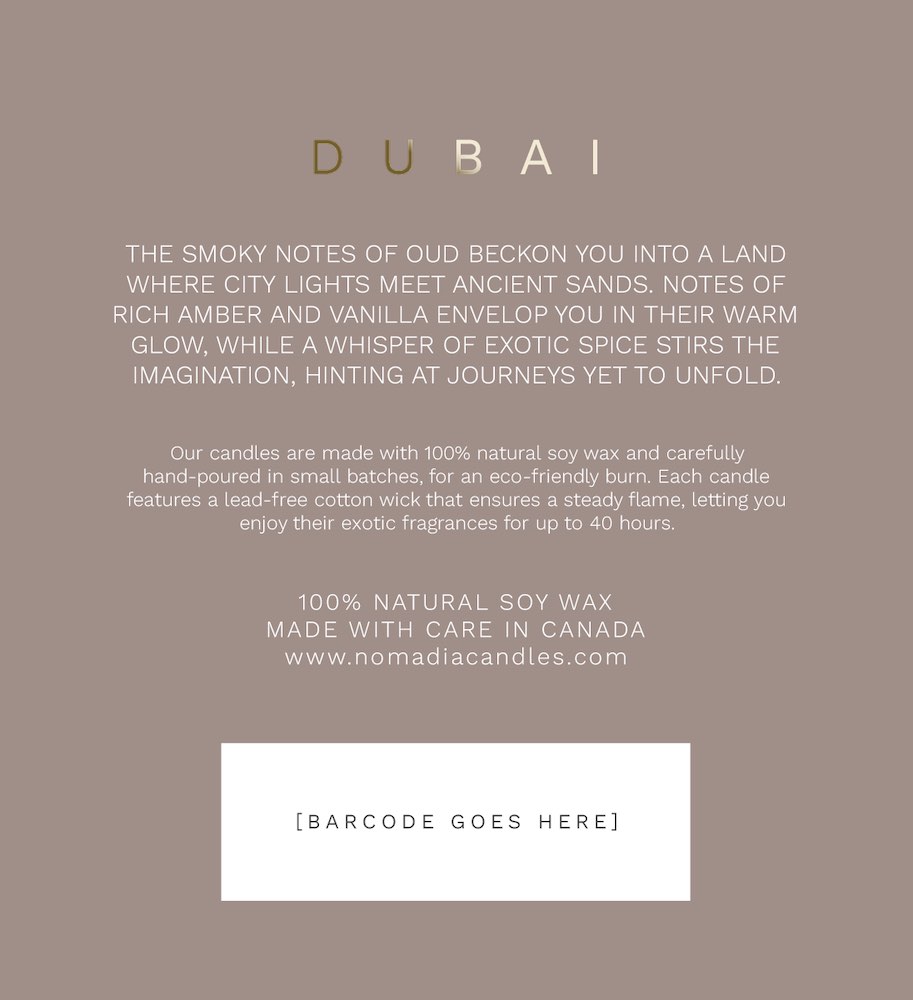
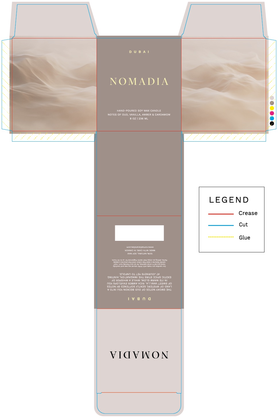
My role was to design a box incorporating two spot colours, an embossed finish, and a gold foil accent. Drawing inspiration from the natural desert tones of the UAE, I chose a neutral palette that conveyed both warmth & sophistication. The minimalistic design is meant to evoke images of quiet luxury, while allowing the brand to easily maintain design consistency for future additions to their destination-inspired line of scented candles.
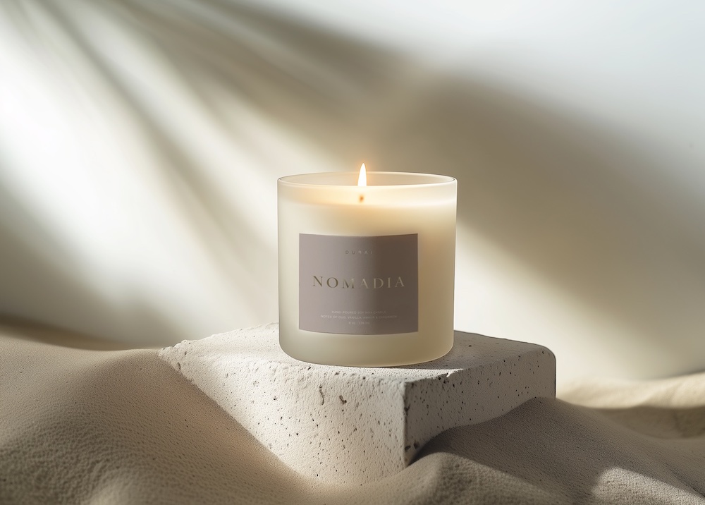
The smoky notes of oud beckon you into a land where city lights meet ancient sands. Notes of rich amber and vanilla envelop you in their warm glow, while a whisper of exotic spice stirs the imagination, hinting at journeys yet to unfold.
The brand name is set in Big Caslon, a serif that lends an air of timeless sophistication. For body copy, Work Sans provides a clean, contemporary balance that ensures readability without sacrificing style. The desert imagery carries the same sense of serenity, inspiring the promise of a soothing experience.