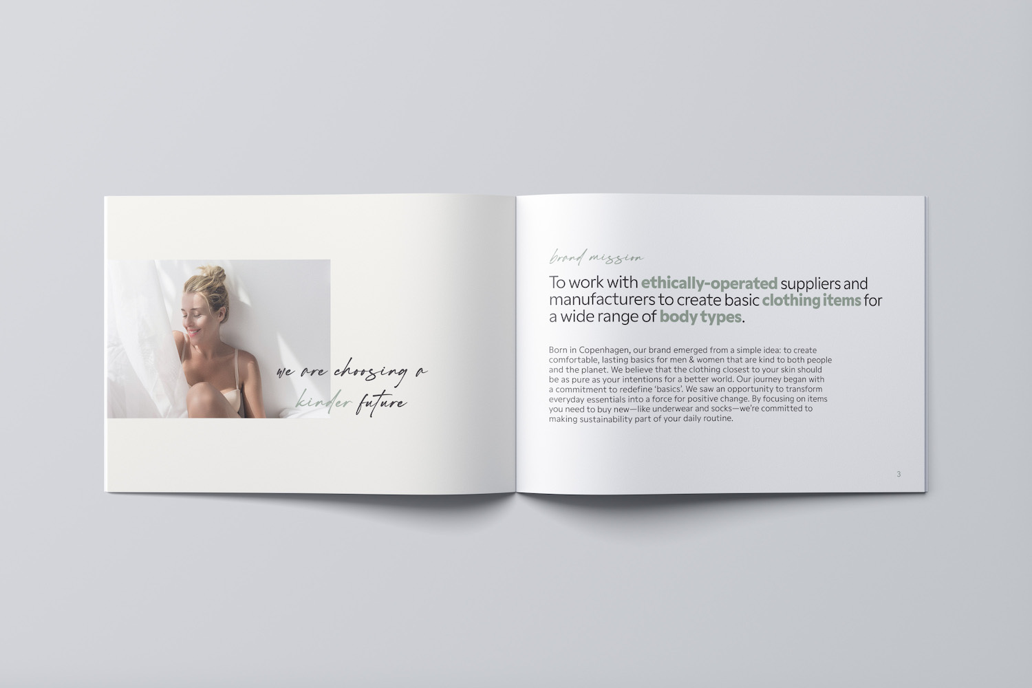
This project asked me to rebrand the existing Organic Basics sustainable clothing company, including developing a style guide. I decided to stay true to the heart of the brand while embracing a more natural, mature style. My goal was to reflect the company’s mission: to be ever kinder to ourselves and the world around us.
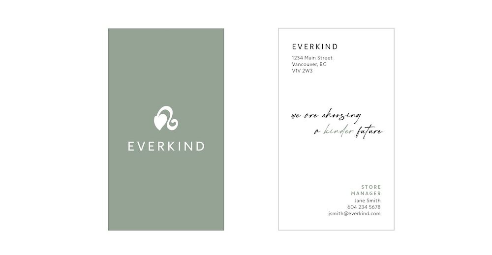
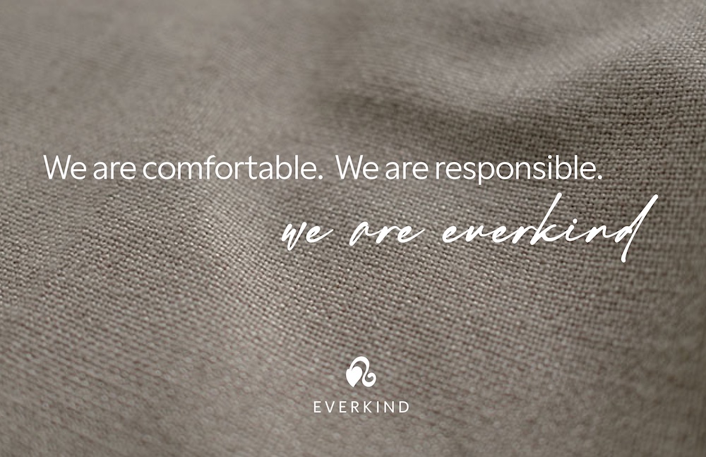
The original idea behind the logo was to combine the shapes of a leaf and clothes hanger to symbolize the things the brand is passionate about: clothing and nature. As I refined this idea, the lines of the hanger transformed into a flowing stem, echoing the gentle curves of the human body. The final version of the logo was turned on its side for a more balanced presentation.
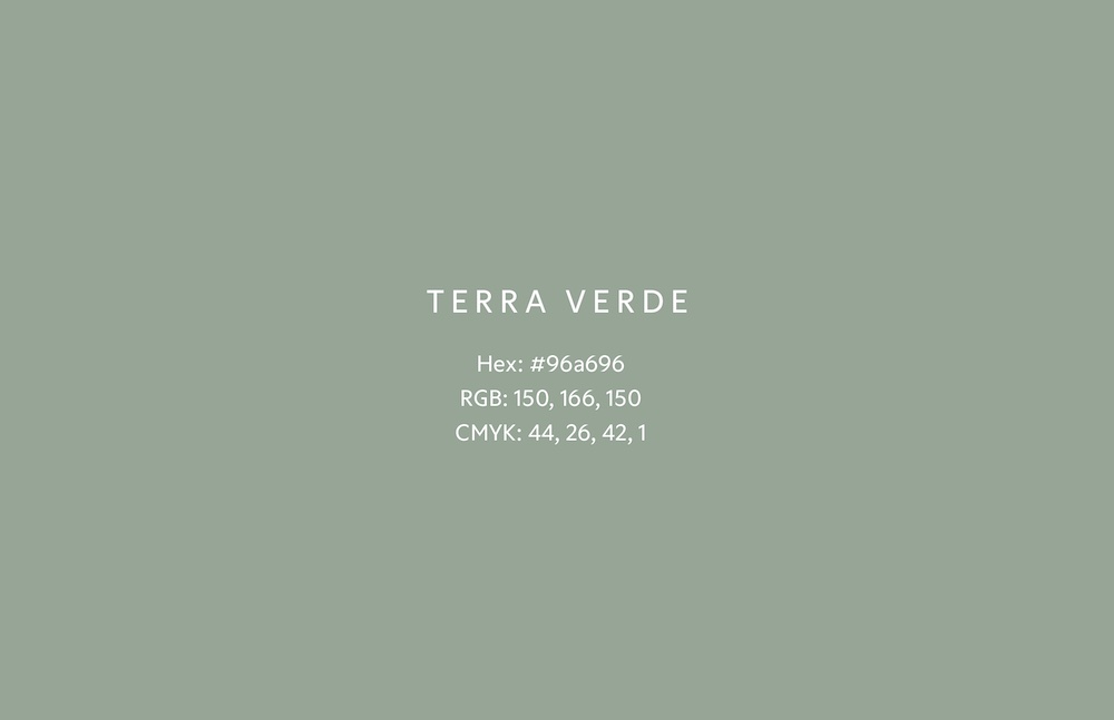
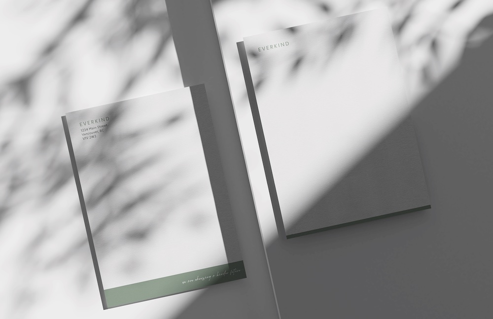
The main colour, Terra Verde, is an earthy representation of the company’s connectedness to the earth as well as their own new growth as a brand. It is meant to represent honesty and authenticity.